Learning Activity – Understanding positioning
This week first learning activities we were going to learn about positioning. We had to explain in our own words what we consider the positioning in these three logos to be.
The first is Coca-Cola. This logo is an old brand, and I think everyone knows this logo and brand. Coca-Cola is one of the most famous companies in the world. It´s a beverage company, started in the 18th century, and they have their products all over the world today. Which make people see them as a loyal brand, and they have a good relationship with the audience. The logo is red and has a typography in the middle. It looks like the typography on the logo is handwritten, which makes the logo like a trustable and “homemade”. They have chosen red, which is very eye-catching color. When you look in a food menu and the logo of the beverages is there, your eyes get drawn to the Coca-cola logo. They sell the beverage in restaurants, in food shops, and they even have like automats on the bus stop or in the streets, so people see the logo every day, and can buy some beverage everywhere. I think they want to be peoples first choice. They have a very strong positioning in the marked.

The next logo is the Volkswagen logo. This logo is a well-known logo, and you can see it on cars every day. Volkswagen is a company that produces cars and has done it since early 1900. The logo is a monogram logo, a design with two letters and it´s the initials of the brand name. V and W. Volkswagen is a strong car name, especially in Norway, they have cars for every need that you may have in a car. They also is very modern and are keeping up with all new technology.

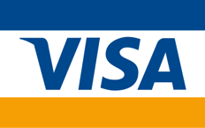
The last logo is the VISA logo. This is maybe the most seen logo for everyone who buys things. Visa is one of the worlds largest payment brand. You can pay with Visa everywhere you buy something. Visa’s positioning is for everyone, everywhere. When I see a pay options, I usually chose to pay with Visa, because I automatically feel safe with my money with Visa.
2. The next task was :
Look at the logo on the Apple iPhone and, by doing your own research, investigate the history of the product and the company that manufactures it. Give an outline, in your own words, of what you consider the following to be:
- Describe its brand identity – exactly as you see it
The brand identity of Apple inc company, and the Apple products is that they always are innovative and minimalistic design. They have an elegant design, modern look, they have products that are easy to use and can fit all kinds of humans. They want to make peoples life easier. I think that if Apple was a person that the person would be an elegant, helpful, hardworking, new thinking, positive human. Focus on emotions. Always wanting to help and have a solution to every problem.
- What do you think its positioning is currently?
They made a phone that had something no one else had seen before, and everybody wanted an iPhone. They did good for many years, and leaded the position in the tec marked, but now I think they have some very good competitors like Samsung, Google and Huawei. Apple is positioned as a luxury brand with high prices, innovation, modern design and the costumers has high expectations and trust in Apple.
- What do you think the strategy for this specific product was?
I think that the strategy was to come up with something innovative, user friendly and to find out what the costumers was missing or needed in their lives. Then make it all about the experience. Also, to have the knowledge to deliver exceptional customers experience on the iPhone. They also come up with a new version or upgraded version of the iPhone every year to keep the interest up an to sell more a more every year.
- What research do you think was done on this by the company who made it?
I think they researched a lot for what people need in their life, and what they could have been needed, if it existed. How are the society developing, and how the iPhone can take a part of that. Make the iPhone more like a tool for many day-to-day things and entertaining, not just a phone. I think they also saw what others did and tried to come up with things that make the iPhone unique. Talked to costumers and listen to their feedback.
Now take the same product as in question 2 and explain, in your own words, how the visual element (in this case, the logo) fits in with the brand identity.

The logo in Apple is of an Apple, with a bite missing of it, so you don’t mistaken it to be some other fruit. The logo is clean, simplicity and modern. It is also timeless like the design of the products. A minimalistic logo, with no colours. I think the logo fits the brand identity well.
Lynda video on Create a Brand Strategy by Lindsay Pedersen
